Wellness Spa Chain Rebranding: Uniform-First Identity Transformation
An 8-location wellness spa chain in Saudi Arabia repositioned its brand identity by starting with uniforms — deploying 200 custom garments in a sage-green palette across all locations, recycling 2.4 tons of legacy uniforms, and driving a 38% increase in social media engagement.
- Client
- Wellness spa chain, 8 locations across Western Province — 200 staff
- Duration
- 12 weeks (concept to 8-location deployment)
- Headline
- 8 locations
- Scope
- Full brand refresh programme, 200 staff, complete uniform replacement, legacy garment take-back and recycling
The numbers.
from initial concept to delivered uniforms across all 8 locations — meeting the client's brand launch deadline with zero delays.
of legacy uniforms collected and processed through UNEOM's closed-loop textile recycling programme — diverting 100% from landfill.
in social media engagement on rebrand-related content vs. the 6-month pre-rebrand baseline — uniforms became the most-shared visual asset.
Why uniforms led the rebrand
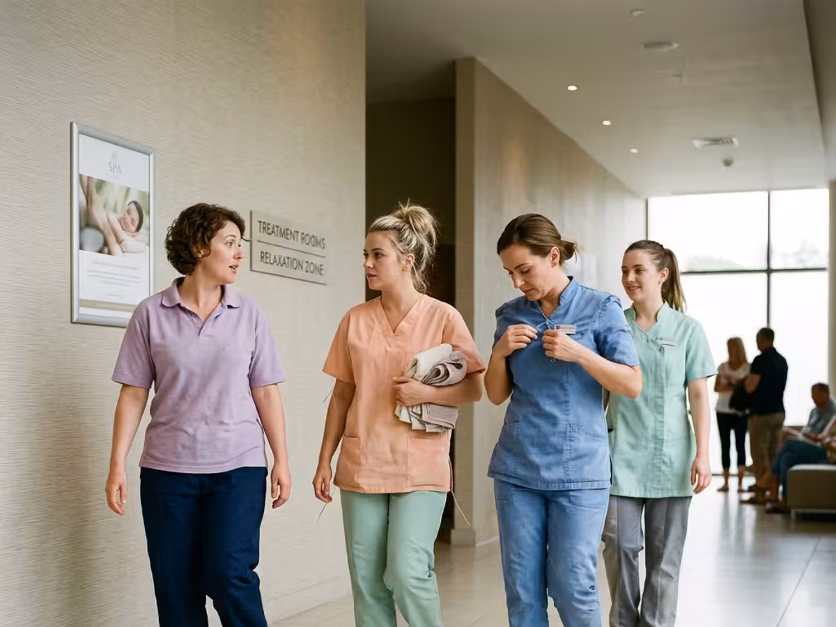
When this 8-location wellness spa chain decided to reposition from a mid-market operator to a premium wellness destination, the creative agency identified a counterintuitive insight: uniforms reach customers 100× more frequently than logos, signage, or advertising. Every treatment session, every reception interaction, every Instagram story filmed by a guest features staff uniforms as the dominant visual element. The previous identity — monochrome black across all roles — communicated clinical efficiency but failed to convey the warmth, nature-connection, and holistic wellness positioning the rebrand sought to achieve. The decision was made to lead the entire brand refresh with uniforms: if the staff visual identity was transformed first, every subsequent touchpoint (interior design, marketing materials, social media content) would automatically align around the new direction. UNEOM was engaged not just as a uniform supplier, but as a brand-identity partner for the most visible dimension of the rebrand.
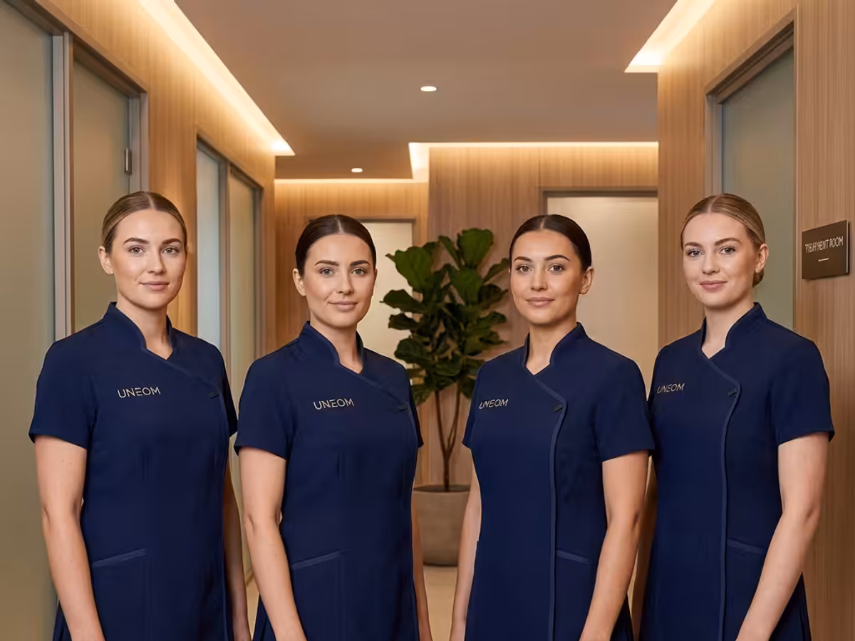
The colour strategy
Colour selection for a wellness brand is not aesthetic preference — it is psychophysiological engineering. We worked with the client's brand agency to develop a palette anchored in colour psychology research relevant to the Saudi wellness market. The primary colour — sage green (Pantone 5645 C) — was selected for its clinically documented associations with calm, nature, and physical restoration. The secondary tone — warm cream (Pantone 7527 C) — provides contrast without visual aggression. The accent — soft gold (Pantone 7403 C) — signals premium positioning without luxury-brand ostentation. The colour transition from monochrome black to sage green was the single most dramatic visual signal of the repositioning. We produced 26 dye batches to achieve Delta E <0.8 consistency across three different fabric types (performance jersey for therapists, woven poplin for reception, cotton twill for support staff). Each batch was verified under the spa's specific lighting conditions (warm LED, 2700K–3000K) to prevent metameric colour shift between locations.
Role-differentiated design system
The design system maintained a unified colour palette while differentiating roles through silhouette and detail elements. Treatment therapists received wrap-front tunics with adjustable ties — designed for ease of movement during massage and body treatments, with strategic stretch panels at the shoulders and underarms. The wrap construction allows therapists to dress and undress quickly between treatments without pulling garments over the head (a hygiene and hairstyle consideration flagged by staff during the discovery phase). Reception and concierge staff received structured blazers over relaxed-fit blouses — projecting formal authority while remaining approachable. The blazer features a custom hammered-gold button set exclusive to the brand. Support and housekeeping teams received crew-neck polos in the sage-green palette with contrast cream piping — maintaining brand consistency while providing the unrestricted mobility required for physical work. Every garment carries the rebranded crest — a hand-embroidered motif positioned at the left chest — produced on a single digitised template to ensure identical placement across all 200 garments.
Take-back programme and sustainability
The rebrand required the complete retirement of 200 staff members' existing uniform inventory — approximately 1,200 individual garments totalling 2.4 tons of textile waste. Rather than sending this to landfill, UNEOM activated its closed-loop take-back programme. The process: (1) collection at each location on the same day new uniforms are deployed — ensuring a clean visual cut-over with no "mixed identity" transition period; (2) sorting and grading at UNEOM's processing facility — garments are categorised by fibre composition, condition, and recyclability; (3) processing — usable garments are donated to certified charitable organisations; damaged or branded garments are shredded and processed into industrial textile insulation material. The entire 2.4-ton collection was diverted from landfill: 0.4 tons were donated, and 2.0 tons were recycled into secondary textile products. The sustainability metrics became a central element of the client's rebrand communications — the "2.4 tons recycled" figure appeared in press releases, social media campaigns, and investor presentations, positioning the brand as a sustainability-conscious operator in the Saudi wellness market.
12-week deployment timeline
The 12-week timeline was non-negotiable — the client had committed to a brand launch event with media partners, and uniform deployment had to be complete across all 8 locations before launch day. Week 1–2: Design finalisation and fabric sourcing. Final colour approval required three rounds of physical fabric samples reviewed under spa lighting conditions. Week 3: Staff sizing across all 8 locations. Our mobile fitting team visited two locations per day, using a digital sizing system that captured measurements and preferences simultaneously. Week 4–7: Production. 200 garment sets (each containing 5 tunics/blazers, 3 trousers/skirts, and 2 outerwear pieces) manufactured on a dedicated production line. Week 8: Quality inspection, individual packaging, and logistics staging — each garment inspected against 18 quality checkpoints. Week 9–11: Phased deployment — two to three locations per week, coordinated with each location's operating schedule to minimise service disruption. Week 12: Take-back collection, final quality check, and programme handover. Every milestone was hit on schedule. The brand launched with 100% uniform deployment on day one.
Brand impact and measured results
The rebrand impact was measured across three dimensions over the 6 months post-launch. Social media: Instagram and TikTok engagement on rebrand-related content increased 38% versus the pre-rebrand baseline. The sage-green uniforms became the single most-tagged visual element in guest-generated content — outperforming interior design shots and treatment photos. The most-shared post category was "therapist introduction" videos where the new uniforms provided a visually distinctive, on-brand backdrop. Guest perception: NPS surveys showed a shift in brand-descriptor language — "clinical" and "standard" decreased by 40%; "premium," "natural," and "inviting" increased by 55%. Staff sentiment: internal surveys showed 89% of staff agreed that the new uniforms "better represent the brand I want to work for" — and the chain's HR director reported a measurable decrease in first-90-day turnover following the rebrand, though multiple factors contributed. The programme established a precedent within the chain's parent group: two additional brands under the same ownership subsequently engaged UNEOM for uniform-led identity projects.